This is a library of CSS code snippets for applying gradients to various WordPress elements.
Blurred Background Blobs
- Give the layout element (section, column, etc.) a CSS ID of ‘blurblob’.
- Apply the following CSS to that layout element or add it directly within the element.
- Adjust the color, blur, position, etc., as desired.
#blurblob:before {
    content: "";
    background: #b57dff;
    opacity: .6;
    filter: blur(100px);
    width: 550px;
    height: 350px;
    border-radius: 50%;
    position: absolute;
    left: 50%;
    top: 84px;
    transform: translate3d(-25%,0,0);
}
#blurblob:after {
    content: "";
    background: #02bcf5;
    opacity: .6;
    filter: blur(100px);
    width: 550px;
    height: 350px;
    border-radius: 50%;
    position: absolute;
    left: 50%;
    top: 160px;
    transform: translate3d(-75%,0,0);
    z-index: -1;
}
Box Shadow
selector .element {
    box-shadow: -5px 0px 10px -3px rgba(181,125,255,1),0px 3px 15px -3px rgba(2,188,245,1),0px 10px 15px -12px rgba(37,234,237,1);
}
Underline
selector .element {
    border-bottom: 2px solid transparent;
    border-image: linear-gradient(90deg, rgba(181,125,255,1) 0%, rgba(122,115,255,1) 33%, rgba(2,188,245,1) 67%, rgba(37,234,237,1) 100%);
    border-image-slice: 1;
}
Dashed Gradient Underline
For any element where you would like to apply this design, such as an Elementor widget (Heading, Text Editor, etc.), assign the ‘gradient-underline’ CSS class to that element.
- Adjust Line 2 to set how far the underline appears below the element.
- Adjust Line 8 to add or change colors.
- Adjust Line 13 to set the thickness of the underline.
.gradient-underline {
  padding-bottom: 8px;
  position: relative;
  margin:auto;
}

.gradient-underline::after {
background-image: radial-gradient(circle, #000000, #472528, #8b483b, #ca7642, #467ff7);
  content: "";
  position: absolute;
  bottom: 0;
  left: 0;
  height: 4px;
  width: 100%;
  /* we show from 0 to 7px then a gap until 9px (2px gap)*/
  -webkit-mask:repeating-linear-gradient(to right,#fff 0 7px,transparent 0 9px);
          mask:repeating-linear-gradient(to right,#fff 0 7px,transparent 0 9px);
}
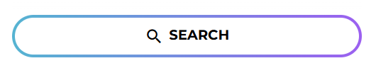
Gradient Outlined Buttons
.your-button-class {
    border-radius: 100rem;
    padding: 1rem;
    text-transform: uppercase;
    padding: 0.5rem 3rem;
    color: black;
    box-shadow: 0 0 6px 0 rgba(157, 96, 212, 0.5);
    border: solid 3px transparent;
    background-image: linear-gradient(
            rgba(255, 255, 255, 0),
            rgba(255, 255, 255, 0)
        ),
        linear-gradient(90deg, #06b6d4 0%, #a855f7 100%);
    background-origin: border-box;
    background-clip: content-box, border-box;
    box-shadow: 2px 1000px 1px #fff inset;
    transition: all ease-in-out 0.2s;
    font-size: 0.813rem;
    font-weight: bold;
}
.your-button-class:hover {
  box-shadow: none;
  color: white;
}