This is a library of CSS code snippets for applying gradients to various WordPress elements.
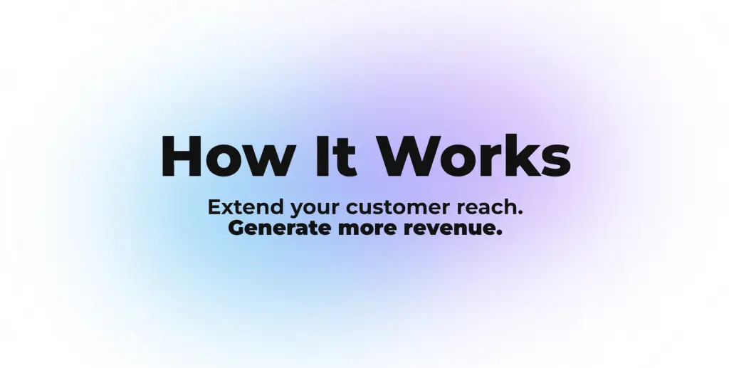
Blurred Background Blobs
- Give the layout element (section, column, etc.) a CSS ID of ‘blurblob’.
- Apply the following CSS to that layout element or add it directly within the element.
- Adjust the color, blur, position, etc., as desired.
#blurblob:before {
    content: "";
    background: #b57dff;
    opacity: .6;
    filter: blur(100px);
    width: 550px;
    height: 350px;
    border-radius: 50%;
    position: absolute;
    left: 50%;
    top: 84px;
    transform: translate3d(-25%,0,0);
}
#blurblob:after {
    content: "";
    background: #02bcf5;
    opacity: .6;
    filter: blur(100px);
    width: 550px;
    height: 350px;
    border-radius: 50%;
    position: absolute;
    left: 50%;
    top: 160px;
    transform: translate3d(-75%,0,0);
    z-index: -1;
}
Box Shadow
selector .element {
    box-shadow: -5px 0px 10px -3px rgba(181,125,255,1),0px 3px 15px -3px rgba(2,188,245,1),0px 10px 15px -12px rgba(37,234,237,1);
}
Underline
selector .element {
    border-bottom: 2px solid transparent;
    border-image: linear-gradient(90deg, rgba(181,125,255,1) 0%, rgba(122,115,255,1) 33%, rgba(2,188,245,1) 67%, rgba(37,234,237,1) 100%);
    border-image-slice: 1;
}